
December 4, 2017
Hello everyone!
We just pushed out a highly-requested update to monster stat blocks to use the familiar format used in all other D&D products.
Monsters Listing and Details
Whenever you visit the Monsters Listing or the details page for a monster, you'll see the new format:
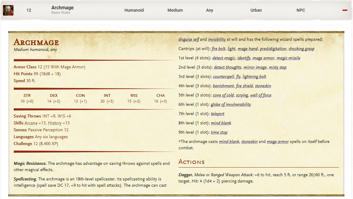
We are trying out a new tooltip style as you see in the new stat block. The loud green and purple colors didn't fit well with the stat block feel, so we're trying to be more subtle. Let us know your thoughts on how well that works.
Print View
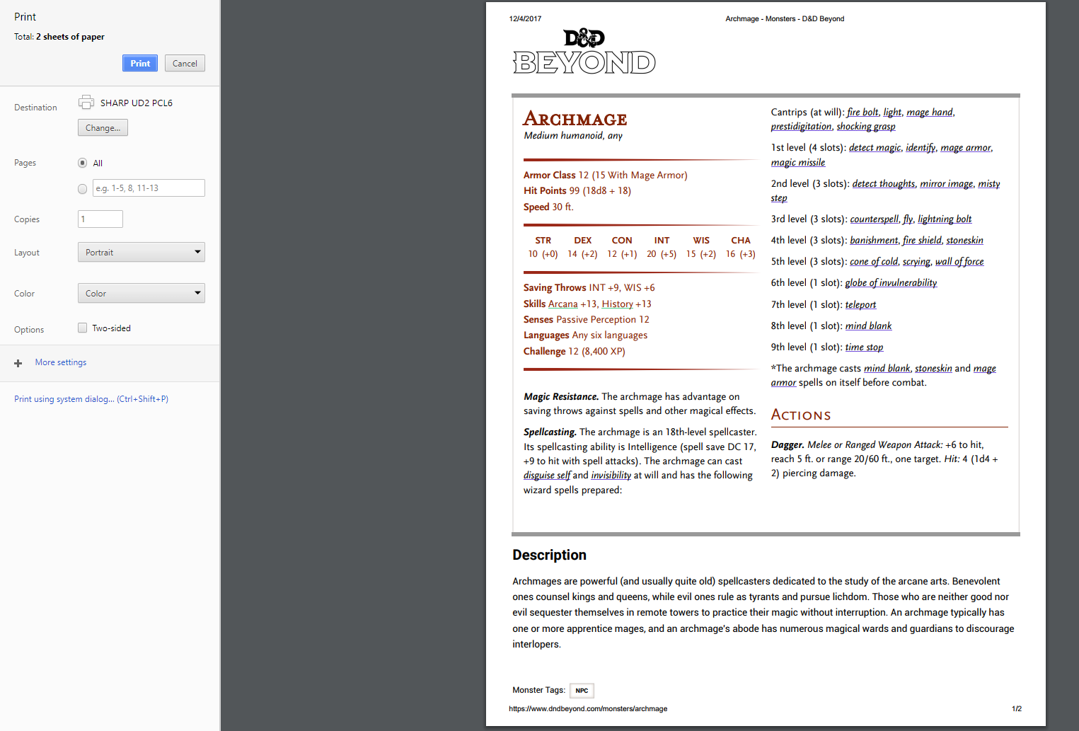
We've also heard that many players like to use DDB to print out monsters, items, and spells. While more permanent solutions (like spell/ monster cards) are on the roadmap, we have dramatically improved the printability of many of our pages with this update.
An example monster print view:
You can also see the changes on Compendium pages (and more):
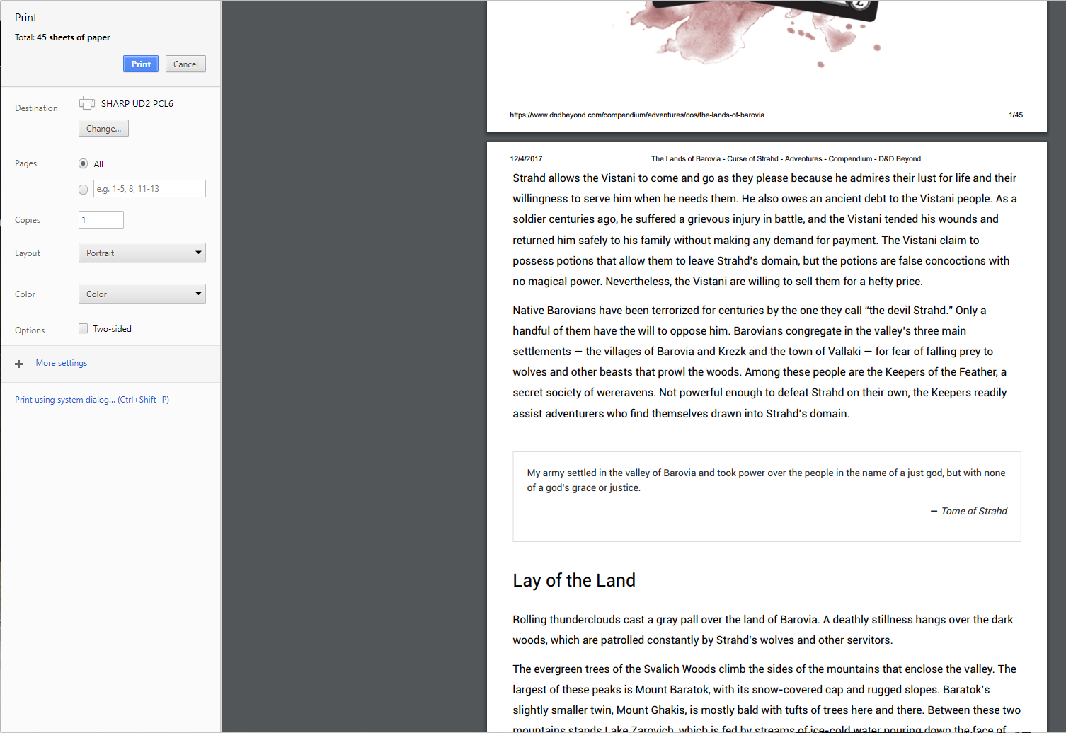
Again, plenty more improvements to make content more useful when printing are on the way, but we hope this is a good stopgap.
That's all for today. We're working hard on getting the mobile alpha out (soon) and the first phase of the character sheet revamp in parallel with these quality of life changes.
Thanks!
-
View User Profile
-
Send Message
Posted Dec 4, 2017This is pretty freaking awesome. Keep up all the great work! <3
-
View User Profile
-
Send Message
Posted Dec 4, 2017While I appreciate the printing improvement... whoo-boy, piracy is going to skyrocket... not so sure that's a great idea.
-
View User Profile
-
Send Message
Posted Dec 4, 2017No, I don't think I like just the colored underline. How about changing the word's color, not underlining it, and not bolding it? And can we get the option to switch back to the old format?
-
View User Profile
-
Send Message
Posted Dec 5, 2017Not sure the background graphics that make it look like MM entries is entirely necessary. Looks pretty though and I guess that's what people were asking for.
One thing, is there any way that paragraphs could be kept together instead of being forced to split to the next column?
-
View User Profile
-
Send Message
Posted Dec 5, 2017-
View User Profile
-
Send Message
Posted Dec 5, 2017-
View User Profile
-
Send Message
Posted Dec 5, 2017Just pushed v0.4.0 of Beyond Help Chrome Extension with support to the new monster layouts. Soon the new version will be on store.
-
View User Profile
-
Send Message
Posted Dec 5, 2017For those spellcasters, could it be possible to have the spell descriptions? At least an abbreviated version of them?
-
View User Profile
-
Send Message
Posted Dec 5, 2017This looks fabulous! I like the new tooltip look, but I can see the point being made below by fellow posters. Maybe a compromise between the bolded, brightly colored tooltip style and the underline which is a little harder to see would be a thicker underline?
-
View User Profile
-
Send Message
Posted Dec 5, 2017I love this. Thank you for this update.
-
View User Profile
-
Send Message
Posted Dec 5, 2017THANK YOU SO MUCH!!!!
-
View User Profile
-
Send Message
Posted Dec 5, 2017Wow. I didn't request any of those changes and I still think they're awesome. Good job.
-
View User Profile
-
Send Message
Posted Dec 5, 2017-
View User Profile
-
Send Message
Posted Dec 5, 2017In actually sitting down and preparing for tomorrow night's session, I've now sort-of done a dry run for how it will play at the table. I have to say, I'm liking it more than my initial impressions now. I can see the link underlines well enough to target or avoid with the cursor and the format of two columns as well as how it's all laid out is much easier to reference. Proof's in the pudding, of course, so we'll see how it fairs tomorrow night :)
-
View User Profile
-
Send Message
Posted Dec 5, 2017Mostly good, but I have to say the underlining is a bit too subtle. Personally, I think you should go back to bolded links, just in a more appropriate color scheme. For the purists who want the statblocks to look exactly like the book, maybe you could just remove all hyperlinks from the print view or something along those lines?
-
View User Profile
-
Send Message
Posted Dec 5, 2017I'll add my vote to retain the original bright and bold tooltip style. Those jump off the page and very clearly scream I'm a ToolTip! The new version just looks like s generic html hotlink instead.
I love that the stat block layout matches the style of the books now and think that is a fantastic improvement. Another great job by the staff getting a highly requested chance pushed out for us. Thank you for the hard work!
-
View User Profile
-
Send Message
Posted Dec 5, 2017I'm also going to comment that I do not like the underlined tooltips. It reminds me of websites that put ads in their content, underlining a word like "battery" then when you hover over it you are killed with battery ads. I know these aren't ads, but I shy away from these underlines, and as they are harder to see, they definitely will result in undesired popups occurring, and thus feel intrusive.
Other than that though, love the update, thanks!
-
View User Profile
-
Send Message
Posted Dec 5, 2017I guess I am part of the minority that thinks the underlined links are better for this case. I enjoy the increased uniformity, rather than splotches of color scattered around from various tooltips. Good job on this update! Much appreciated!
-
View User Profile
-
Send Message
Posted Dec 5, 2017Very impressed I like it alot! It is definitely a great start. One of my questions is, can you make it so bold headings will always wrap to the next page. Example I tried printing the adult gold dragon listing. The Legendary Actions subheading appears on page one but then the description appears on page 2. It would look nicer if the subheading was bumped down to page 2 to accompany the description of the legendary actions. It is a very small thing. I am not complaining because I think it all looks great. I just think that minor improvement would make it look even better and be even easier to read. Thanks for continuing to update this program. We just keep getting more value from the product as we go! Love it!
-
View User Profile
-
Send Message
Posted Dec 5, 2017I will mention on my iOS device, I don’t see the underline. Not sure what i can click on. Removing the formatting would make it inconsisted from the other pages in the site.
If I printed these, then yes, the format as it is now (just italicized) would work. But on screen, the old style is better for its usability.