Thank you for your feedback. I'm sorry you're losing out on some stuff.
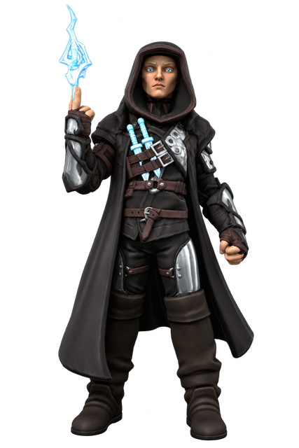
I've "reskinned" each armor mode's "main weapon" as actual weapons in order to not seem like Iron Man. So the ranged attack from the Infiltrator mode are throwing knives made out of lightning (hence the light source).
Here are the images in their fullest as linked above:
Do you have any tips on making just unique looking stuff as to not make certain types of minis the same like say Dragonborn’s or like palidans or rouges
Absolutely, man! Read through this thread in detail. I feel like I've given a lot of advice on that topic in the past. But, when you submitted a model for the character art challenge last month, you didn't really follow those pieces of advice already in the thread.
Maybe get a piece of paper. Read through the thread carefully. Physically write down each thing that seems like it may be a way to improve a figure or make it more interesting.
The biggest thing I would suggest for you is to be more intentional with what you do. Next would be to look at some real images of people ... not drawings ... REAL images and look at what things actually look like and how people stand.
You could even take a look at the advice specifically on painting and them look at the paint only submission you had and see areas for improvement.
These are rhetorical questions about your painting challenge submission.
Why is the sword sheath the exact same color as the cross guard? Why is the leather handle of the sword the exact same color as the metal cross guard and the sheath? Why is the pommel the exact same color as the handle and the cross guard and the sheath? Why is the exterior boarder of the shield the exact same color as these things? Why is the wood the same color?
Why is the wood on the javelin, and also the leather wraps and also the metal counter balance at the end ALL the same color? And, why are they all a flesh color? Using flesh colors as colors for leather can be perfect, and can make something look wonderfully creepy But, what in the world would the shaft and counter balance be made of to look like this?
Why is the inside of the shield bright purple glowing magic?
Why are there 4 layers of decals on the face but only two different decals used with the same decal layered 3 separate times.
Why do you have 4 default color decal colors in your mix? One of those is actually visible on the figure as an unpainted thing and the others are buried layers of decals that can't be seen.
(I did absolutely LOVE the color you brought into the decal on the clothing. the blue/green/white celestial coloration was wonderful!)
Dragonborn are one of the harder of the standard 2024 5E species to do on heroforge. They don't have a ton of options and it's hard to make things that actually look reminiscent of the dragons they come from. Genuinely, the hardest species to make for the options in the PHB.
I've mentioned this before ... try to make a REAL person. It's good practice. Try to make a fictional character. I've posted things in here that look like ... the X-man professor X, and Dexter from the show Dexter, and Jason from the Friday the 13th movies. And Iron Man. And, I posted some designed to look like specific actors as an exercise to work on creating custom facial structures.
I think you may want to focus on the basics. The foundational stuff. Take a figure you've already made and just .... pose them different ways. Do a kneeling position. Do an action pose. Do a stationary pose. Could they be doing something different with the things they're holding? Can you make them showing emotion? Make them happy. Make them sad. Make them frightened. Make them shy. Make them angry. Can you do this with more than just the emotion sliders? What happens to their shoulders ... how does their back and torso change ... might their face look more or less directly at what is happening in front of them? Take any figure you have and save an a,b,c,d,e version of it and with each one ... pose it entirely differently. Take one of those poses that you like a lot. Use save as to save a bunch of variations and save a 1,2,3,4,5 and try to paint them totally differently. With some you can focus on primary, or secondary, or tertiary colors (if you don't remember learning about those in elementary school, look them up ... they sure never came in handy for me professionally). You can tell any AI what you're working on and which colors you have and ask it for suggestions on colors that would go with it and they'll give you ideas for other colors to use (you can use RGB values or hex codes to build these and the AI can give you the RGB values or hex codes exactly). Which colors do you rely on the most? Paint a figure and refuse to use those colors at all.
Try new things. Challenge yourself. Make 5 or 6 of them, then show me your favorite of the bunch and tell me what you tried and what you like about it and what you learned along the way.
So I tried your advice (on a mostly human looking character there slightly older in age and an elf )and it worked quite well but the posing is slightly off and I can’t fix it tonight probably because I have dnd soon but it’s been helping even on my non humanoid models todyssey also how do you name your models when hero forge names have to be short
Hex and RGB color options now only show up if “Numeric Inputs” are enabled.
Go into the heroforge settings. Then click the option to see Numeric Inputs. It will show up. You really only need this if you're setting colors based on these values. It seems like a reasonable thing to make this an option. Most people won't use it.
So I tried your advice (on a mostly human looking character there slightly older in age and an elf )and it worked quite well but the posing is slightly off and I can’t fix it tonight probably because I have dnd soon but it’s been helping even on my non humanoid models todyssey also how do you name your models when hero forge names have to be short
For generic stuff I name them by species and then class. Then a number. The number lets me do multiple options of that species and class. Then, I'll throw a letter on the end for posing or paint variations on that same species and class combination. This gives you options to make alternations to things in the future.
If it's a named character I'll save them with the character name for that character.
Generally this will give you the ability to relatively find things as you need them. I also have a number of things saved that people have requested and I have a slightly different naming convention for these.
I have 260 figures at the moment. This work for me.
They make it easy to rename things. You do can do it from the page where you can see all of your minis side by side. Single click on a mini and a pencil icon will appear. Click on that pencil and you can rename things.
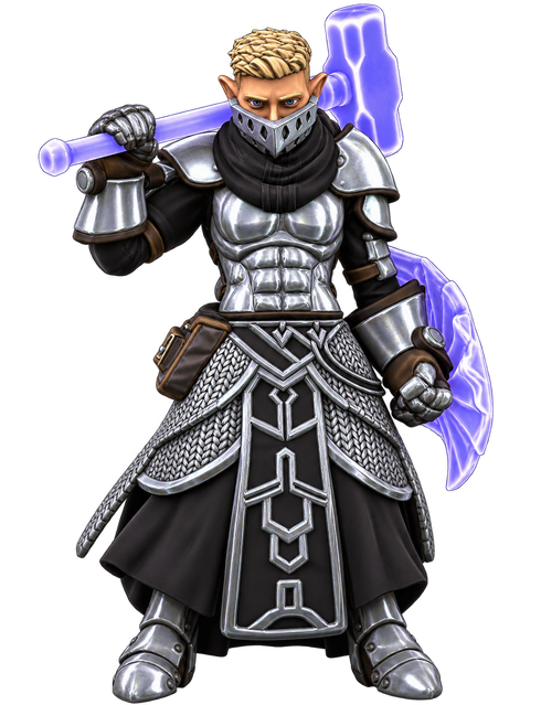
This was a quick first pass at your second figure. Just like the first, I think what you have is really good, man!
Just like with the first one, I don't pay for kitbashing. So, when I go to look at the figure in detail all of the kitbashing gets removed and I won't comment on that.
Some areas where this is lacking are REALLY common (so don't worry about them too much). You'll see this with almost every figure everyone makes. You don't really have a custom face. You didn't really pose the face. You didn't really do anything to change the pose and look of the figure to make it less stagnant. It just looks like a mug shot. There's no motion. No fluidity. It doesn't look real. Go look at photos on instagram or whatever. No one stands straight facing a camera, with their head basically straight on and also with their eyes straight on. That's not a thing. And, when you see it, it looks weird.
Absolutely love the decal on the skirt to give the look of metal mail.
Make the head custom (this is tricky with the metal thing magically hanging off the face, but it was true in the other figure, and it's true here, too).
Pose the head in some way. You wanted it looking up with a downward tilted head. The previous figure was the opposite. This is more motion in the head than most people do, so that's good. But, you'll want more going on.
The bag is clipping into the figure a little bit. This is really minor.
You're using materials without logic in some places. It's a fantasy piece ... this can be fine. Will assume the metal mask is bolted into his jaw or something. The metal outlining cloth on the figure LOOKS nice, but it's just metal. It doesn't look like fabric or cloth in any way. And, that means those things don't bend or yield or give. They're like plates.
You're using a couple colors for metals which is good! It's boring if everything is the same color. But, the secondary metal color you have (boots vs bolts on boots) is SO similar to the first that it's hard to see that it's different. Increase their differentiation.
The stubble decal on the head is awesome. Love that detail. The coloration makes it look like the figure dye's their hair color though. I tried making the stubble the same blonde and it looked pretty bad. I made the hair color up top darker and it worked fine. So, the stubble and the hair on top is the same color. And, it's still a blonde character. This makes the color look more natural.
Shading decal around the eyes. Always shade the eyes. This is one of the easiest ways to make your figure look better than others. There would almost always be some kind of lighting difference around the eyes.
There is posing in the head. The eyebrows are much more expressive (that's all you can see). The eyes themselves are no longer looking basically through the skull. You couldn't see the full pupils before, so the angle was changed. You'll see the eyes are looking a little to the character's left. The head is looking a little left of where the torso is. The torso is moving a little to the right.
I changed the overall angle of the figure, and adjusted the head and eyes accordingly. The figure is no longer perfectly straight on. I also adjusted the torso a bit. It's fairly subtle. But, now there's a little twist and a bit of a lean to one side.
I swapped out the metal being used as a liner color for a leather and shaded it to look more like metal. I think you can spend a little more time with this ... it's not perfect yet. The idea is to use a flexible fabric that's been infused with metal. It won't look exactly like metal. The mail in the skirt works because it's small pieces woven together.
The shoulders were opened up a little, and the figure's left arm was swung out slightly.
The figure you started with looks great. These are all minor. The key takeaways from your two figures are:
Customize the face. Make it actually look unique. If you don't all your character faces will look like all your other character faces and basically just like every other novice's character faces.
Pose the face. Find some emotion.
Do not point the torso, head, and eyes all in the same direction. It's what every novice does and it's boring. Create some angles and things will look like they have motion. As you start to do this you'll find more movement in the torso and arms and rotation with the feet. You'll have a more realistic looking figure.
Rollback Post to RevisionRollBack
To post a comment, please login or register a new account.
Thank you for your feedback. I'm sorry you're losing out on some stuff.
I've "reskinned" each armor mode's "main weapon" as actual weapons in order to not seem like Iron Man. So the ranged attack from the Infiltrator mode are throwing knives made out of lightning (hence the light source).
Here are the images in their fullest as linked above:

Do you have any tips on making just unique looking stuff as to not make certain types of minis the same like say Dragonborn’s or like palidans or rouges
Absolutely, man! Read through this thread in detail. I feel like I've given a lot of advice on that topic in the past. But, when you submitted a model for the character art challenge last month, you didn't really follow those pieces of advice already in the thread.
Maybe get a piece of paper. Read through the thread carefully. Physically write down each thing that seems like it may be a way to improve a figure or make it more interesting.
The biggest thing I would suggest for you is to be more intentional with what you do. Next would be to look at some real images of people ... not drawings ... REAL images and look at what things actually look like and how people stand.
You could even take a look at the advice specifically on painting and them look at the paint only submission you had and see areas for improvement.
These are rhetorical questions about your painting challenge submission.
Why is the sword sheath the exact same color as the cross guard? Why is the leather handle of the sword the exact same color as the metal cross guard and the sheath? Why is the pommel the exact same color as the handle and the cross guard and the sheath? Why is the exterior boarder of the shield the exact same color as these things? Why is the wood the same color?
Why is the wood on the javelin, and also the leather wraps and also the metal counter balance at the end ALL the same color? And, why are they all a flesh color? Using flesh colors as colors for leather can be perfect, and can make something look wonderfully creepy But, what in the world would the shaft and counter balance be made of to look like this?
Why is the inside of the shield bright purple glowing magic?
Why are there 4 layers of decals on the face but only two different decals used with the same decal layered 3 separate times.
Why do you have 4 default color decal colors in your mix? One of those is actually visible on the figure as an unpainted thing and the others are buried layers of decals that can't be seen.
(I did absolutely LOVE the color you brought into the decal on the clothing. the blue/green/white celestial coloration was wonderful!)
Dragonborn are one of the harder of the standard 2024 5E species to do on heroforge. They don't have a ton of options and it's hard to make things that actually look reminiscent of the dragons they come from. Genuinely, the hardest species to make for the options in the PHB.
I've mentioned this before ... try to make a REAL person. It's good practice. Try to make a fictional character. I've posted things in here that look like ... the X-man professor X, and Dexter from the show Dexter, and Jason from the Friday the 13th movies. And Iron Man. And, I posted some designed to look like specific actors as an exercise to work on creating custom facial structures.
I think you may want to focus on the basics. The foundational stuff. Take a figure you've already made and just .... pose them different ways. Do a kneeling position. Do an action pose. Do a stationary pose. Could they be doing something different with the things they're holding? Can you make them showing emotion? Make them happy. Make them sad. Make them frightened. Make them shy. Make them angry. Can you do this with more than just the emotion sliders? What happens to their shoulders ... how does their back and torso change ... might their face look more or less directly at what is happening in front of them? Take any figure you have and save an a,b,c,d,e version of it and with each one ... pose it entirely differently. Take one of those poses that you like a lot. Use save as to save a bunch of variations and save a 1,2,3,4,5 and try to paint them totally differently. With some you can focus on primary, or secondary, or tertiary colors (if you don't remember learning about those in elementary school, look them up ... they sure never came in handy for me professionally). You can tell any AI what you're working on and which colors you have and ask it for suggestions on colors that would go with it and they'll give you ideas for other colors to use (you can use RGB values or hex codes to build these and the AI can give you the RGB values or hex codes exactly). Which colors do you rely on the most? Paint a figure and refuse to use those colors at all.
Try new things. Challenge yourself. Make 5 or 6 of them, then show me your favorite of the bunch and tell me what you tried and what you like about it and what you learned along the way.
where do I write the hex code in
So I tried your advice (on a mostly human looking character there slightly older in age and an elf )and it worked quite well but the posing is slightly off and I can’t fix it tonight probably because I have dnd soon but it’s been helping even on my non humanoid models todyssey also how do you name your models when hero forge names have to be short
It looks like this literally just changed today. I googled it for you.
https://heroforge.com/content/news/release-notes/
Go into the heroforge settings. Then click the option to see Numeric Inputs. It will show up. You really only need this if you're setting colors based on these values. It seems like a reasonable thing to make this an option. Most people won't use it.
Also is ir just me or are grung for some reason easily to pose and just overall fun to make
For generic stuff I name them by species and then class. Then a number. The number lets me do multiple options of that species and class. Then, I'll throw a letter on the end for posing or paint variations on that same species and class combination. This gives you options to make alternations to things in the future.
If it's a named character I'll save them with the character name for that character.
Generally this will give you the ability to relatively find things as you need them. I also have a number of things saved that people have requested and I have a slightly different naming convention for these.
I have 260 figures at the moment. This work for me.
So something like:
dwarvenBarbarian01
dwarvenBarbarian02
dwarvenBarbarian02b
They make it easy to rename things. You do can do it from the page where you can see all of your minis side by side. Single click on a mini and a pencil icon will appear. Click on that pencil and you can rename things.
This was a quick first pass at your second figure. Just like the first, I think what you have is really good, man!
Just like with the first one, I don't pay for kitbashing. So, when I go to look at the figure in detail all of the kitbashing gets removed and I won't comment on that.
Some areas where this is lacking are REALLY common (so don't worry about them too much). You'll see this with almost every figure everyone makes. You don't really have a custom face. You didn't really pose the face. You didn't really do anything to change the pose and look of the figure to make it less stagnant. It just looks like a mug shot. There's no motion. No fluidity. It doesn't look real. Go look at photos on instagram or whatever. No one stands straight facing a camera, with their head basically straight on and also with their eyes straight on. That's not a thing. And, when you see it, it looks weird.
Absolutely love the decal on the skirt to give the look of metal mail.
https://www.heroforge.com/load_config=60040516/
The figure you started with looks great. These are all minor. The key takeaways from your two figures are: