

December 4, 2017
Hello everyone!
We just pushed out a highly-requested update to monster stat blocks to use the familiar format used in all other D&D products.
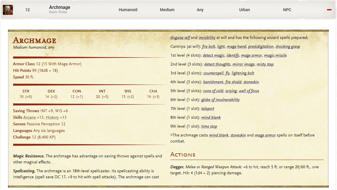
Monsters Listing and Details
Whenever you visit the Monsters Listing or the details page for a monster, you'll see the new format:
We are trying out a new tooltip style as you see in the new stat block. The loud green and purple colors didn't fit well with the stat block feel, so we're trying to be more subtle. Let us know your thoughts on how well that works.
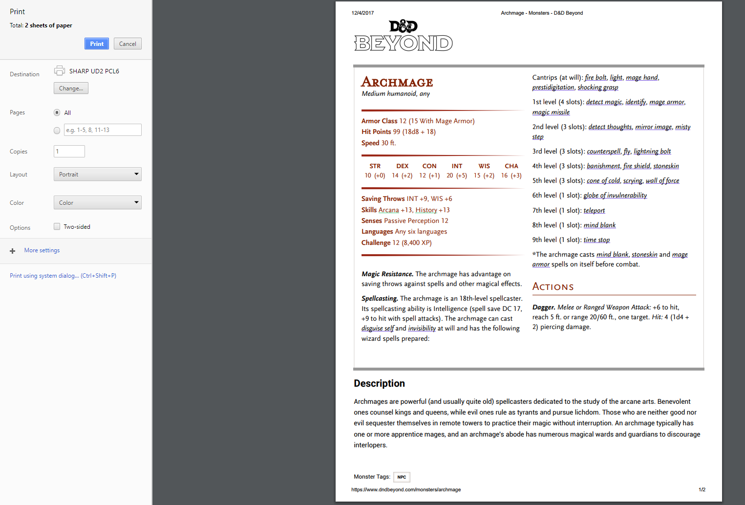
Print View
We've also heard that many players like to use DDB to print out monsters, items, and spells. While more permanent solutions (like spell/ monster cards) are on the roadmap, we have dramatically improved the printability of many of our pages with this update.
An example monster print view:
You can also see the changes on Compendium pages (and more):
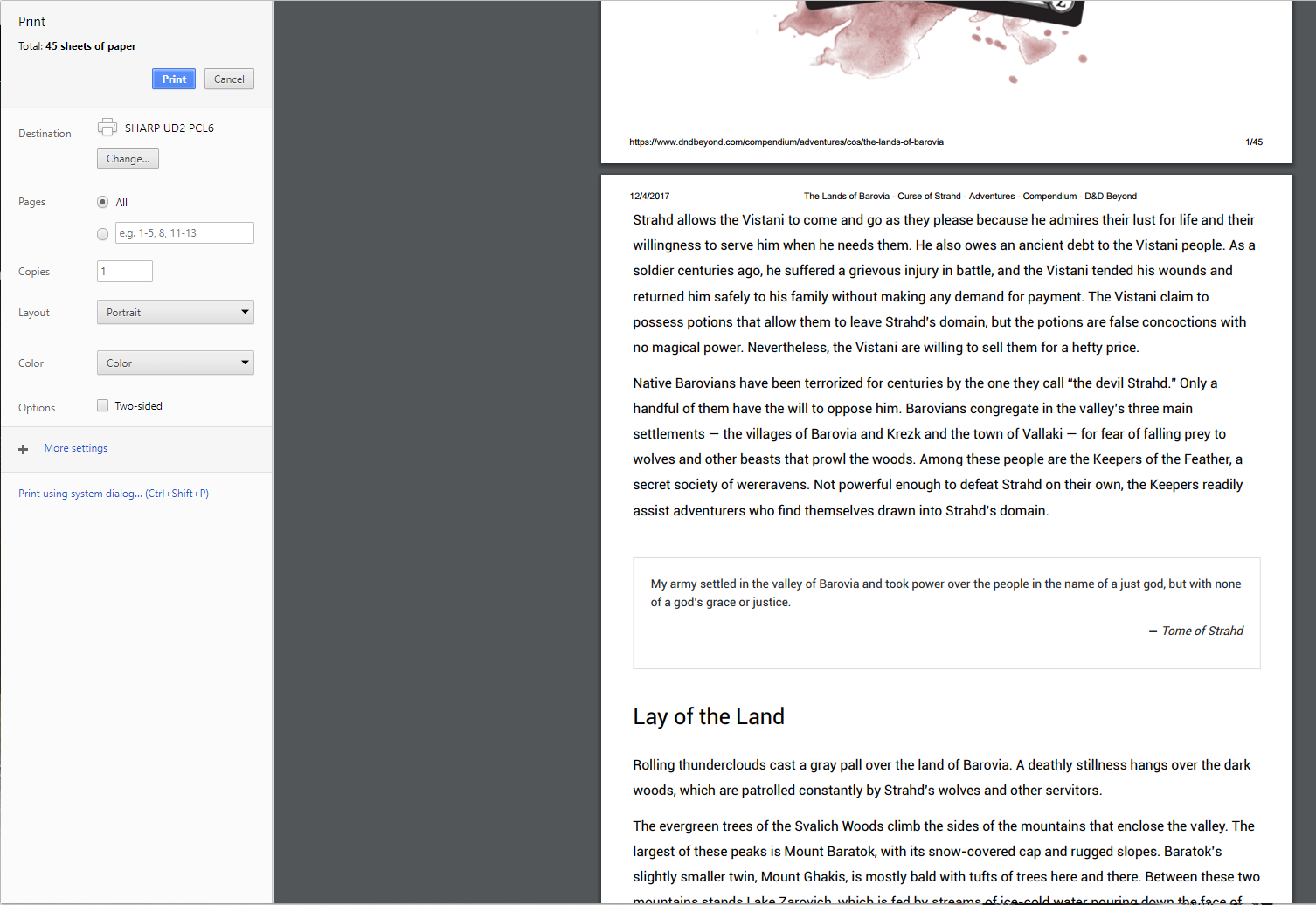
Again, plenty more improvements to make content more useful when printing are on the way, but we hope this is a good stopgap.
That's all for today. We're working hard on getting the mobile alpha out (soon) and the first phase of the character sheet revamp in parallel with these quality of life changes.
Thanks!
-
View User Profile
-
Send Message
Posted Dec 5, 2017I may be in the minority, but I'm not a fan of the textured background or the underlined tooltips. The colored text already made it stand out great and kept it from looking like a generic HTML link (which being a web developer I despise the default styling of). The textured background some may consider cool or a nice touch but I think it greatly cuts down on the readability of the entries (the same criticism can be applied to the text for links being made italics). Honestly, I think as a whole this update was a misstep (the first time I've felt as such for an update you guys have pushed out). The print formatting for stat blocks is great, but the other changes made, in my opinion, provide a lesser user experience.
-
View User Profile
-
Send Message
Posted Dec 5, 2017Great update! I really appreciate the print view improvements. I've been copying things over to other docs to format them for printing, so this will cut down on wasted prep time!
As for the tooltips, I personally think they look fine and unobtrusive. I appreciate the shift to looking more like the book statblock — it makes it feel more like true D&D.
-
View User Profile
-
Send Message
Posted Dec 5, 2017-
View User Profile
-
Send Message
Posted Dec 5, 2017-
View User Profile
-
Send Message
Posted Dec 5, 2017Thank you so much for doing this. I was very hesitant about buying the monster manual, but went for it (and Volo's guide as well) hoping that we would get better print support. Glad I did. Thanks again.
-
View User Profile
-
Send Message
Posted Dec 5, 2017One issue that I'm finding is that for the Grick you can't tell that Darkvision is linked unless you happen to roll over it with a mouse. Grick when actually navigating to the monster listing https://www.dndbeyond.com/monsters/grick.
-
View User Profile
-
Send Message
Posted Dec 5, 2017I like the classic look a lot!
My one criticism is that there’s too much white space around the stat block and the edge of the screen on mobile devices - a box within a box where before there was one box.
I’m not sure how to address that though.
-
View User Profile
-
Send Message
Posted Dec 5, 2017It looks great! I kinda want the whole app skinned in that parchment aesthetic now..
-
View User Profile
-
Send Message
Posted Dec 5, 2017-
View User Profile
-
Send Message
Posted Dec 5, 2017-
View User Profile
-
Send Message
Posted Dec 5, 2017-
View User Profile
-
Send Message
Posted Dec 5, 2017-
View User Profile
-
Send Message
Posted Dec 5, 2017-
View User Profile
-
Send Message
Posted Dec 5, 2017None of the underlines on any stat block appear in Edge.
Edit: I see that BadEye replied to this issue just before I posted this comment.
-
View User Profile
-
Send Message
Posted Dec 5, 2017while the new book-like stat blocks are looking good, i think i prefer the previous style as it was easier to pick out the tooltips and access the information i want. toggles are appreciated.
-
View User Profile
-
Send Message
Posted Dec 5, 2017Thank you, thank you, thank you, thank you, thank you.
Thank you.
-
View User Profile
-
Send Message
Posted Dec 6, 2017I love the new stat blocks! Only one suggestion, you guys should add "text-decoration-skip: ink;" to the CSS for the hyperlinks so their underlines don't overlap low hanging characters and international characters. It would make them a tad cleaner in browsers that support it ;).
-
View User Profile
-
Send Message
Posted Dec 6, 2017I would just like to say to the D&D Beyond team: THANK YOU!
-
View User Profile
-
Send Message
Posted Dec 7, 2017This really decreases the accessibility of the monster pages, which is why I preferred it to my books. If I wanted statblocks that looked like the books... I can just use the books? Any possibility for an option to opt to the more accessibility-friendly style, or at least have it available on mobile?
-
View User Profile
-
Send Message
Posted Dec 7, 2017I shared some more thoughts in the thread here: https://www.dndbeyond.com/forums/d-d-beyond-general/d-d-beyond-feedback/10016-new-monster-stat-blocks-feedback
That gives a good idea of where we are with early feedback. The TL;DR is we will use the official stat block format, but we plan to introduce better use of the space on mobile and an option to view stat blocks with less of the texture and extra styles.
I think those updates will address many of the concerns I've seen here.
In general, it looks like most of you appreciate the change - thanks for letting us know!