


Hey everyone!
I'm beyond excited to tell everyone all about a number of improvements that we've brought to the Compendium over the last few weeks. Without further ado, let's get into it!
Sidebar Improvements & Fixes!
A change that has certainly been long overdue in my opinion - we've finally given the compendium sidebar some much needed love! Here are some of the key improvements we've made:
- The sidebar now has a scrollbar (and is scrollable) to help accommodate pages that have a large number of entries. This means that regardless of your screen resolution, you'll always be able to see all the entries without it being cut off.
- The sidebar now has a darker background to indicate when entries are part of a larger section (for example rooms in a dungeon).
- The sidebar now accurately tracks your position on the page and bolds the corresponding location.
- The sidebar will no longer get cut off by the footer of a page.
Here's an example of some of these improvements in action:
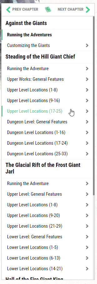
In the coming weeks and months, we will be making more strides toward consolidating many of the split chapters and better improving the experience of the compendium pages (both old and new) so that there aren't quite as many splits like in the .gif above.
Book Refreshes!
A few weeks ago, we updated two more of our older books to meet our current standards of style, accessibility, and better usability; Princes of the Apocolypse and Lost Mine of Phandelver. Here's a quick look at what we've done:
- Making sure that the books are as easy to navigate as possible. This meant that we made sure to add hyperlinks whenever possible and made sure that it brought you to the exact place you would expect - whether that meant a specific section of the page you're on or to a specific room in another chapter.
- Better accessibility. Along with our current standards, we ensured that any and all image subtitles were placed on the page as text instead. We've also begun using more tools to help us with providing more context to screen reader users (using hidden text that's still picked up by screen readers) in order to provide greater clarity (such as with multiple links) We will continue to iterate and improve in this regard.
- Better theming. We've also given this book a visual upgrade in various respects. Not only does it more closely match the book's styles and colors more closely - but with Princes of the Apocolypse I was able to implement something I've always wanted to do for this book - specially styled statblocks! Here's a sneak peek of what I mean:
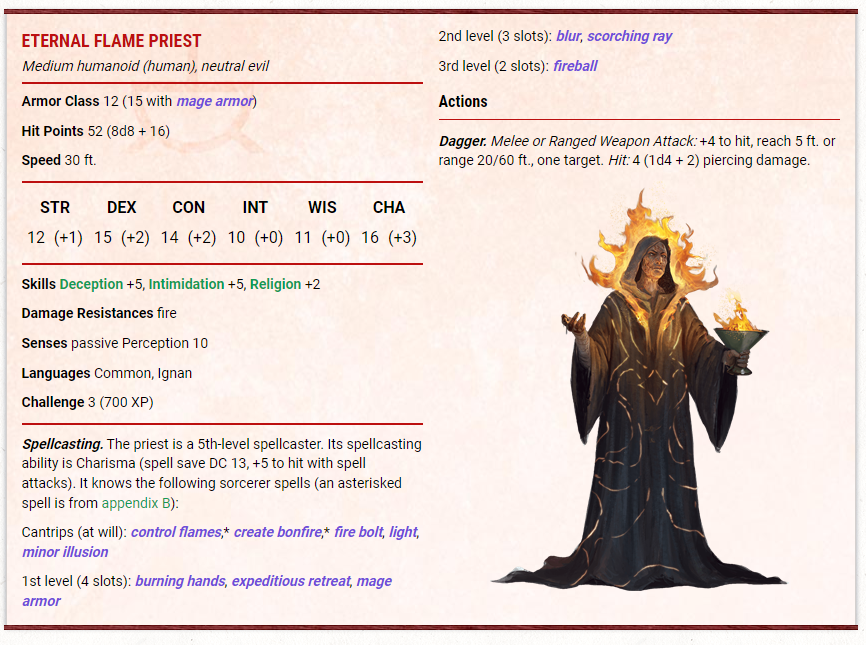
The Eternal Flame Priest finally lives up to his name - General improvements. Consistent with all of our other refreshes - we've also increased the amount of tooltips, increased the quality of the images, and made many other improvements that should make it a lot easier to use!
Other Improvements
Here are a few other improvements we've also made to make your experience better:
- Changed the font size of the various headers to be more consistent and not as weirdly sized.
- Using more consistent and better semantic HTML (such as table captions and ensuring that we don't skip header levels).
- Fixed some minor issues with statblock formatting and made other improvements like darkening the color of tooltips within a statblock to make them easier to read.
- Added hover/focus state to all links in the compendium (when focused/hovered over, the link will have an underline) as well as states for some of the other interactive elements (like the "back to the top" button in the bottom right).
- Improvements to the Table of Contents for our books to be more useful, easier to use, and provide better accessibility. This updated style will be rolled out to more books over the next several months and we will continue to iterate on the design.
-
View User Profile
-
Send Message
Posted Jul 19, 2022Thanks a lot for those quality of life changes! The sidebar was becoming a problem with some classes.
-
View User Profile
-
Send Message
Posted Jul 19, 2022Beautiful start on improvements! These are awesome!
-
View User Profile
-
Send Message
Posted Jul 19, 2022Thank you for the improvements, and for keeping accessibility top of mind!
-
View User Profile
-
Send Message
Posted Jul 19, 2022Awesome! Keep up the great work.
-
View User Profile
-
Send Message
Posted Jul 19, 2022Now please work on Combat Tracker to add Conditions, notes, and such.
-
View User Profile
-
Send Message
Posted Jul 19, 2022Will we ever get page number references so when things are mentioned elsewhere we can look up by page number as it is in the physical books?
-
View User Profile
-
Send Message
Posted Jul 19, 2022This is fantastic stuff! Thank you so much for the updates!
-
View User Profile
-
Send Message
Posted Jul 19, 2022Thank you for fixing the sidebar!
-
View User Profile
-
Send Message
Posted Jul 19, 2022Great stuff. Beyond just keeps getting better.
-
View User Profile
-
Send Message
Posted Jul 19, 2022Sounds like great improvements. Thanks!
-
View User Profile
-
Send Message
Posted Jul 19, 2022As it’s been said before, no. This isn’t going to happen.
-
View User Profile
-
Send Message
Posted Jul 20, 2022These are fantastic! Thank you.
Will someone please show some love to the PbP forums? 1.5 million posts, but still the dice are buggy, the javascript spotty, and there are no integrations with character sheets.
-
View User Profile
-
Send Message
Posted Jul 20, 2022Still no fix for aberrant mind sorcerer. Still can't Change spells for warlock speels.
-
View User Profile
-
Send Message
Posted Jul 20, 2022Fixes for TCoE content should be the number one priority of the dev team at this point.
-
View User Profile
-
Send Message
Posted Jul 21, 2022This is great, i also saw an update to filter races by book, if you could do that with the spells would be awesome since I have some that I am not allowed to use in some campaigns, but I use them so often I forget it does not belong to the allowed campaign books.
-
View User Profile
-
Send Message
Posted Jul 23, 2022It's really great to see these small, but essential improvements. Thank you!
-
View User Profile
-
Send Message
Posted Aug 1, 2022Just catching up on this, and these changes are very welcome! Thanks for doing this work; it doesn't go unnoticed that the team is always finding things that can be improved, even while bigger changes are still awaiting the completion of bigger and more complex work (e.g. the features system etc).
-
View User Profile
-
Send Message
Posted Aug 2, 2022If only you had a vlog on twitch or youtube where you could give updates on new and upcoming releases, that would be amazing. 🤦♂️🤷♂️
-
View User Profile
-
Send Message
Posted Aug 18, 2022To the development team: love what you,re doing with the mobile iPad version.
There are many of us that would love the option to have a larger image of our character in the same way fight club 5 does. With fight club you also have the option under "notes" to add more images of your character or even maps a player has used before. Maps he added that had little personal notes about what he found or killed in those particular rooms.
-
View User Profile
-
Send Message
Posted Sep 4, 2022The improvements are amazing! They help a lot, as I was having trouble navigating.