 Monstrous Compendium Vol. 1: Spelljammer Creatures
 Frozen Sick
 D&D Beyond Basic Rules
 Basic Rules (2014)
Sign in to view your library & saved favorites.
Sign in- Marketplace
Monstrous Compendium Vol. 1: Spelljammer CreaturesFrozen SickD&D Beyond Basic RulesBasic Rules (2014)Sign in to view your library & saved favorites.
Sign in
Hi
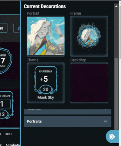
The character sheet settings before were quite usable, everything accessible on the same level, and the portrait/background/theme/frame pickers large enough to see the selection.
With the new grouping half the options are behind a second, unintuitive click, and when you want to choose your portrait/background/theme/frame, half the window is taken away by the "header" showing the current selections, which means it's extremely clumsy and hard to see the list; not to mention the short rest / long rest buttons are now also behind an extra click.
This is a step back in usability, not a step forward. Please restore the previous one as it was two amplitudes more usable than the current one.
--[ Natural 20 - that's how I roll! ]--
We've stopped this OGL madness, but stay vigilant, they tried it once, they can try it again.
I wouldn't call a menu that takes up 3/4 of the area leaving that much less space for content "cleaner" or "more easily navigable".
--[ Natural 20 - that's how I roll! ]--
We've stopped this OGL madness, but stay vigilant, they tried it once, they can try it again.
If I have to choose between a menu that leads me to a setting page where I can see the selection; or a menu that takes up a lot of space and leaves barely and space for the selection, I would obviously choose the first.
If I have to choose between having buttons available for the rest actions and one menu to access all the rest of the config options, OR have a menu to access the rest actions and a submenu to access the other actions, I would go for the first.
This is not a user friendly menu.
--[ Natural 20 - that's how I roll! ]--
We've stopped this OGL madness, but stay vigilant, they tried it once, they can try it again.
The section area is actually the whole bottom half of the pane, you just have to scroll down. Doing so will anchor the menu header to the top while you can scroll through all the options.
To navigate between options, you can either collapse the header to see the full list of customisations,
or click on one of the four previews to jump directly to that option.
Find my D&D Beyond articles here
Compared to the previous version, where on clicking on "Select portrait" for example, the whole window was just showing the selection, this is still 50% space loss.
--[ Natural 20 - that's how I roll! ]--
We've stopped this OGL madness, but stay vigilant, they tried it once, they can try it again.
I agree that the space loss is an issue. If I'm picking a new background, I don't need to be reminded of my current background, I can see it on my sheet.
Birgit | Shifter | Sorcerer | Dragonlords
Shayone | Hobgoblin | Sorcerer | Netherdeep
I made a thread about his when it was released and I completely agree. It's even worse when the frame no longer scrolls with the sheet (low width window) and is low height. You can see a whole 1 line of images that have to load every time you scroll.
I didn't do an example of this but it's pretty easy to test yourselves.Edit: Edem actually posted a pretty good example above. Edit 2: I decided an example might be worth while. See spoiler. Sposta's comment below is very true you can't see them at all at that window size.You can see it doesn't scroll with the character sheet - so that's all the view you get.
This is my proposed solution to the problem. At the very least for smaller window sizes. I can understand on phones or other mobile devices why you'd want to see the selections as you can't see your sheet behind the sidebar but for desktop users it's not ideal.
You wanna see really bad space waste? Try it on a smartphone turned sideways. 🙄
Creating Epic Boons on DDB
DDB Buyers' Guide
Hardcovers, DDB & You
Content Troubleshooting